KORO - East Boston, MA.
For Koro that recently opened — I managed everything from the interior to the brand.
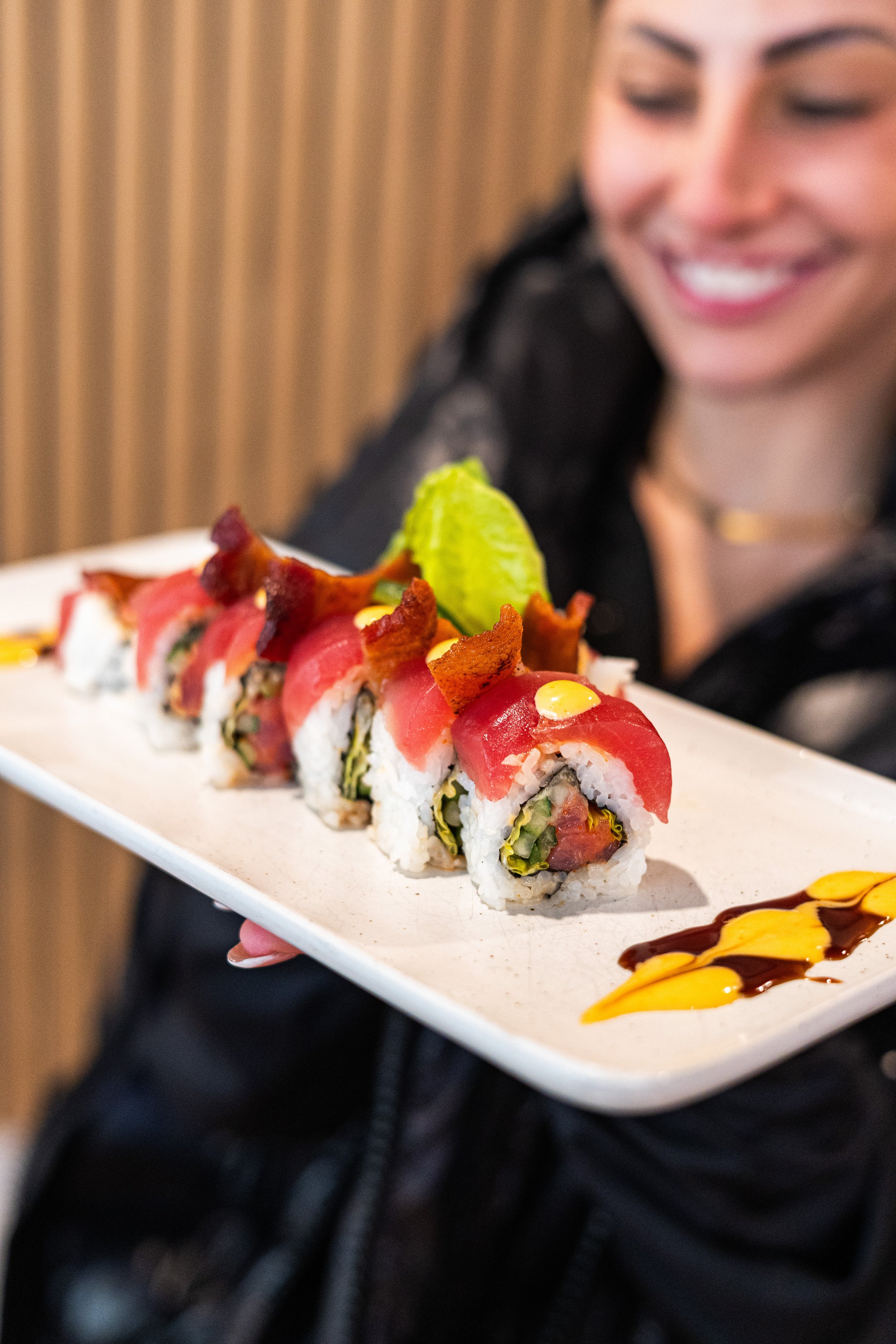
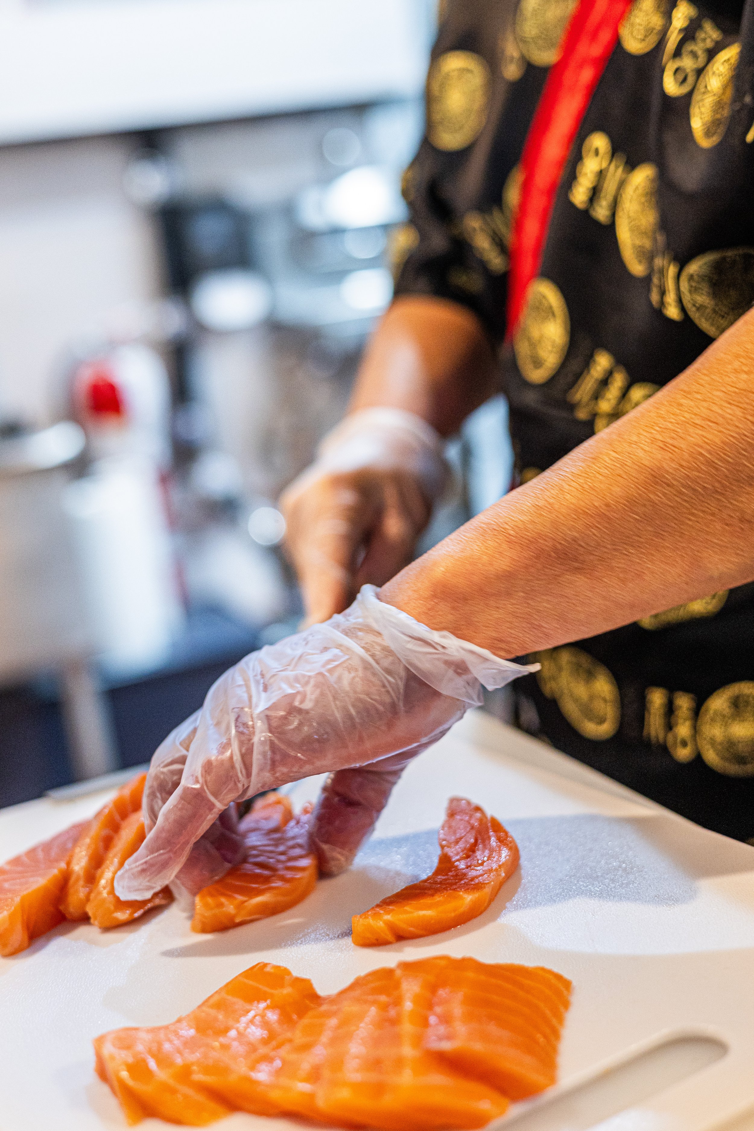
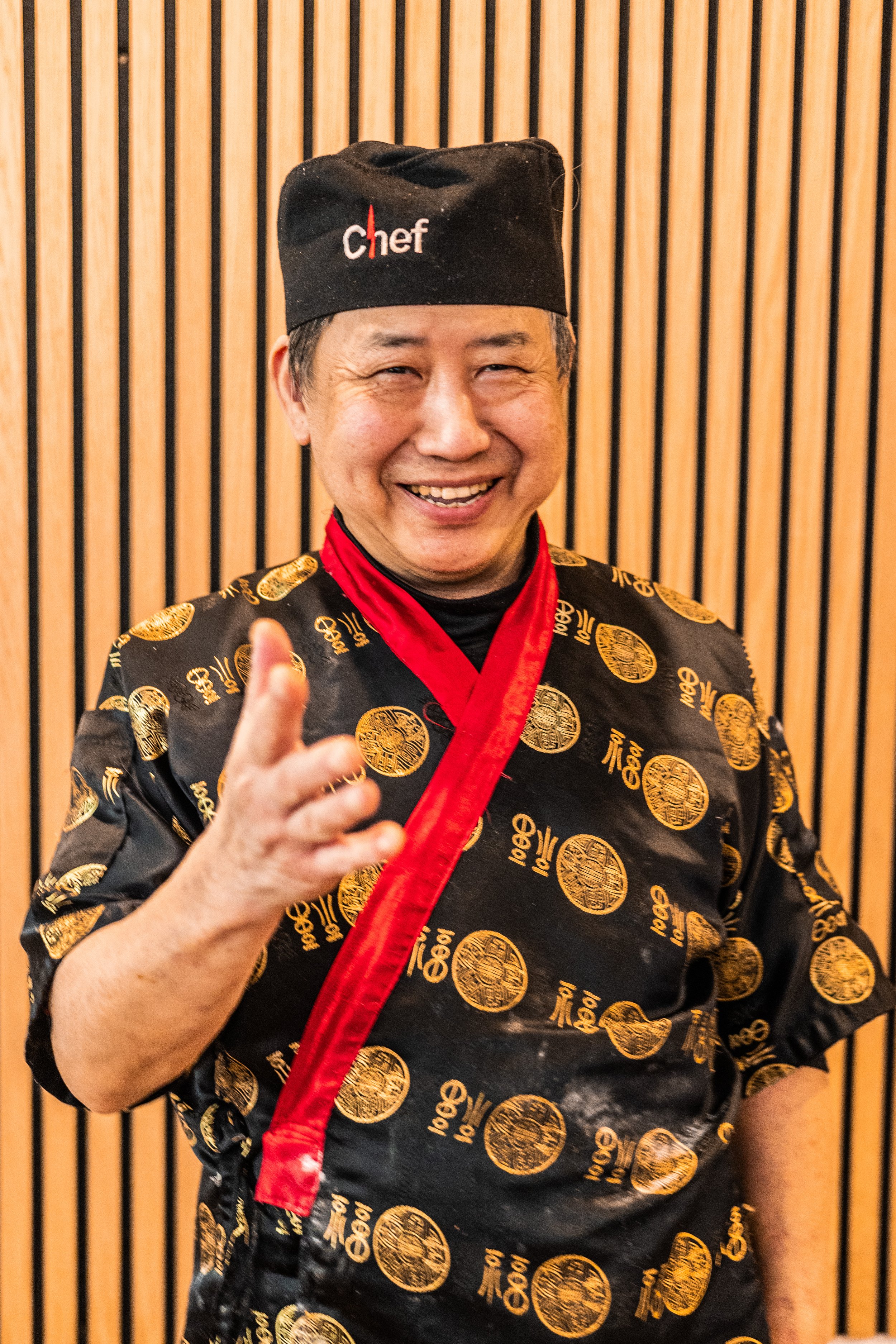
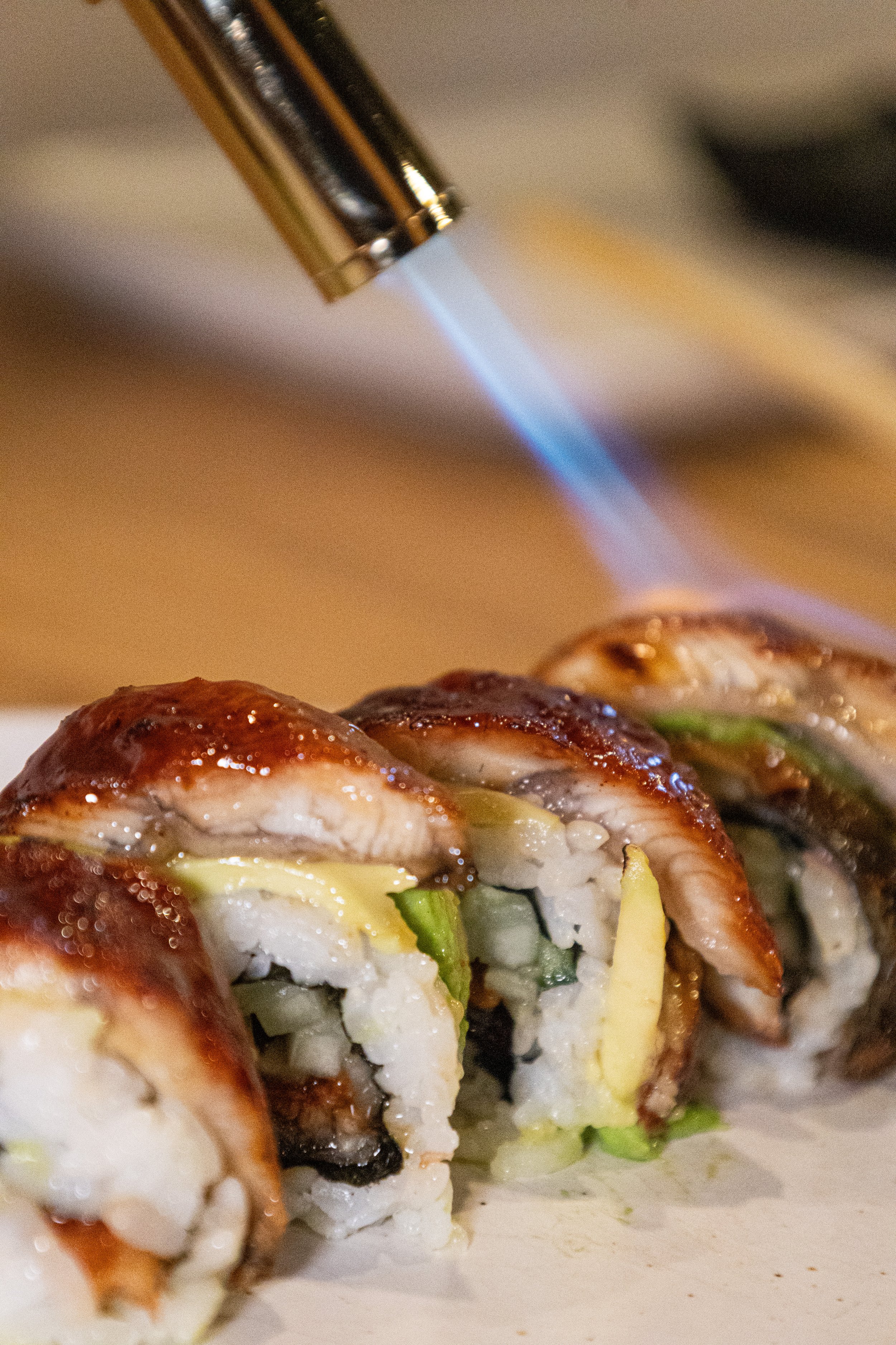
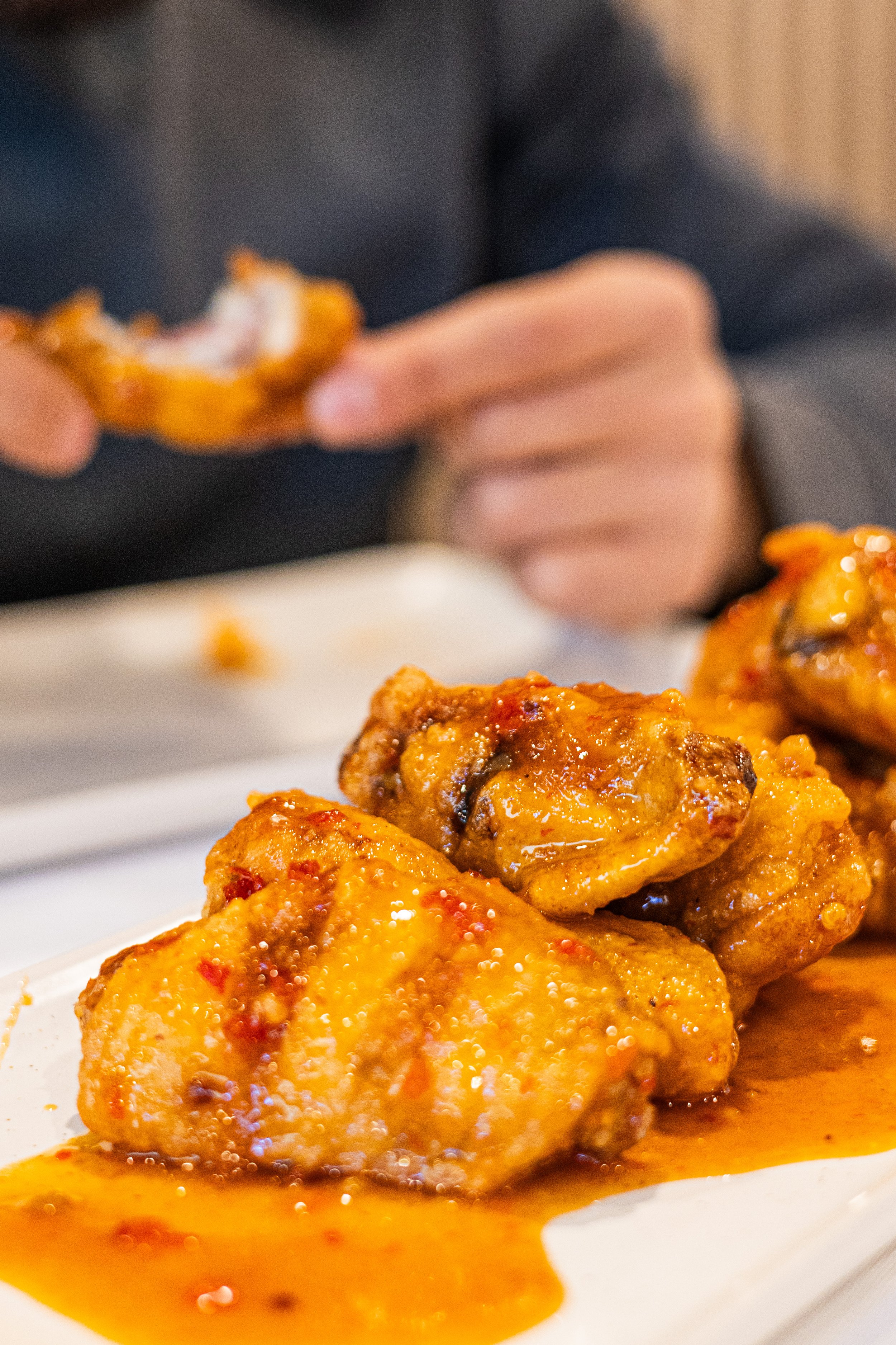
The space was guided by the initial brand kit. The aim of opening a japanese restaurant with both dine-in and takeout was to create a comfortable space that wasn’t too gimmicky. The choices of the brand kit were inspired by an earthy orange that followed with secondary natural colors to match of soy sauce, charcoal, etc. All things japanese influenced.
While the fonts were reprsenting the simplicity and quiet of the culture but also the boldness of a calligraphy brush stroke. The photography is shot with a hard flash or grain for the intention of an approachable, neighborhood spot that isn’t trying too hard while the captions follow. A non-serious approach while taking the quality of food very seriously. The tone is playful, all lowercase and signs off with an “xoxo, koro” every time. The copy has to always be ALL CAPS or all lowercase as a stylistic choice. There are no uses of facial emojis.