Interior Design Consult:
Before & After
Pazza on Porter, East Boston.


the work, color choices
& rebranding process
This project had a quick turnaround time and a rebrand in the process. We were able to get a branding roll out and finish the restaurant in just 2 months - which was exciting!
I had to choose everything very, very quickly. The paint colors, furniture, trinkets, curtains, murals, plates, server uniforms, menus, etc!
To start, we took a look at the previous branding. There was a whole lot of red, bold fonts and murals around the space of Mona Lisa. We wanted the brand to move to a more retro, italy in the 70’s direction.
Pazza’s logo was the first to go! With the help of a graphic designer, Patricia, we worked on the brand first to lead the space. We wanted scribbled art, fun and old school italian colors: green, cream, yellow, orange. Oddly, a deep burgundy was not at all in my mind at the start of this project.
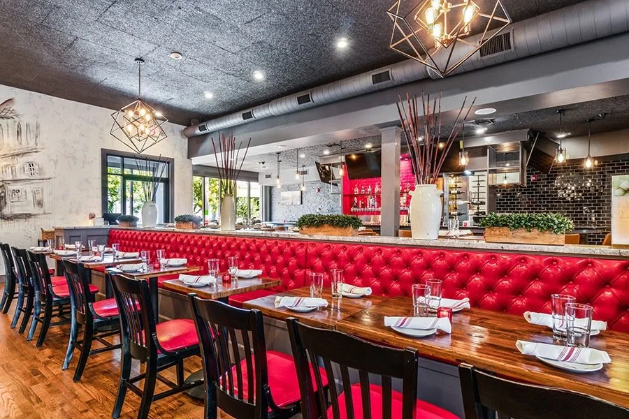
The previous architects who started to imagine the space painted every wall this deep brown with a red tint. I actually didn’t like it all — but slowly the brown inspired red to me. It made me see that red was a proper color choice. The italian flag, duh!
Wall color choice is the biggest way to make a quick impact. It can be scary to choose bold colors. My choices were Benjamin Moore: Sweet Basil, Wenge, Ballet White and Nantucket Gray.
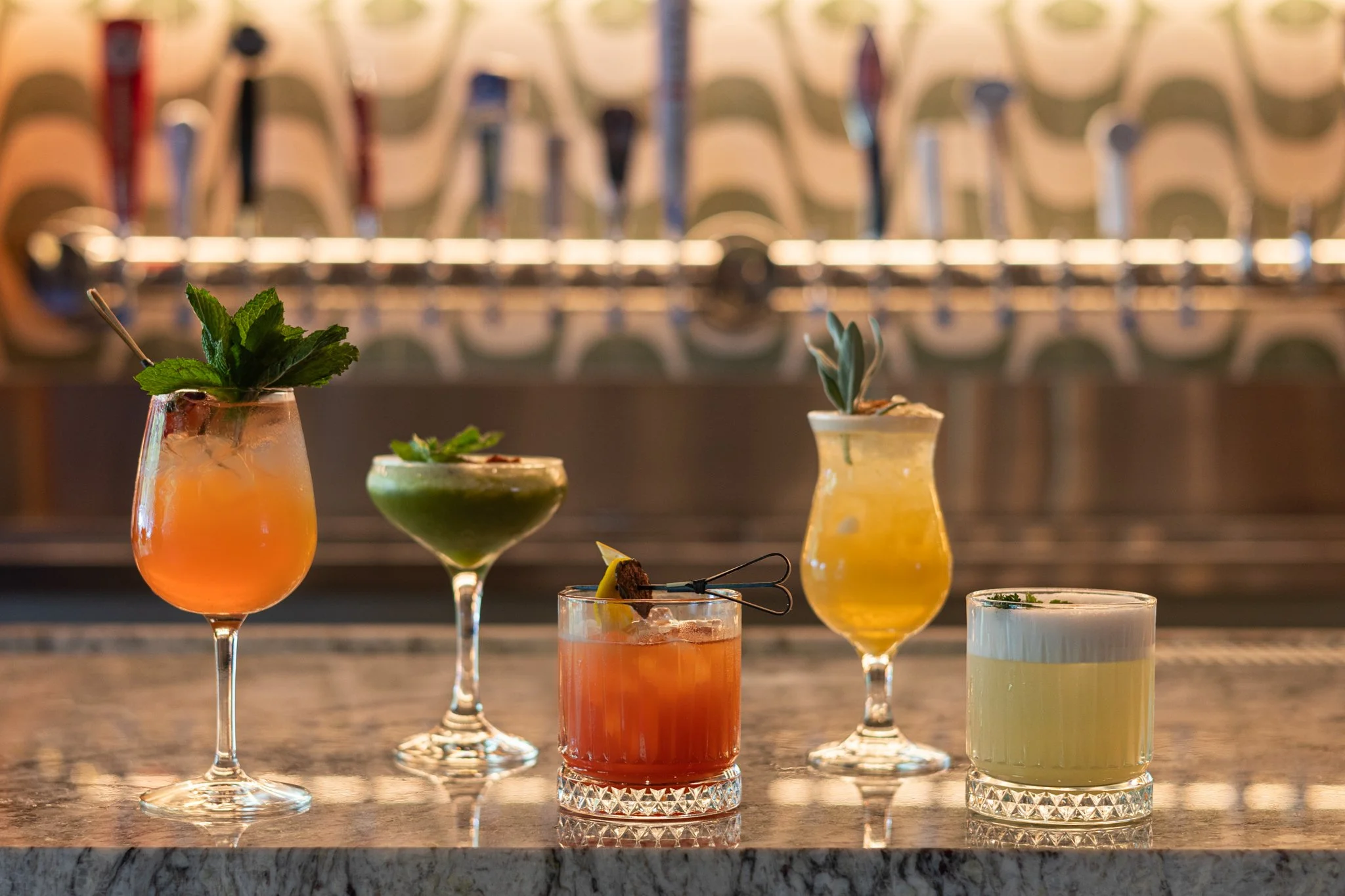
A look at the bar tiles and slab. (Right Above)
Myself in front of the newly beloved Wenge color and Slim Aarons art. (Right Below)