Rebranding and Launch: Before & After
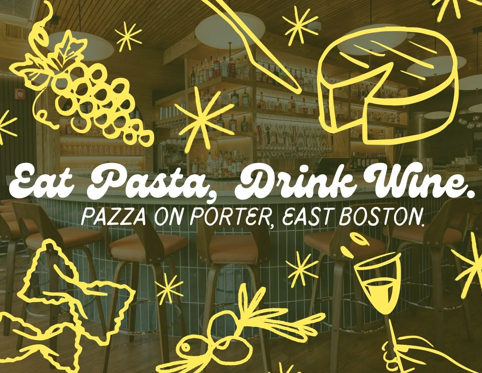
Pazza on Porter, East Boston.
out with the old! in with new, that is also… old.
This project was lead by my Brand Kit and Photography. The furthering of the rebrand was executed by my Graphic Designer, Patricia who ties everything together with a pretty bow for me! Thank you, Patricia! Shout out to her.
A bit about the project…
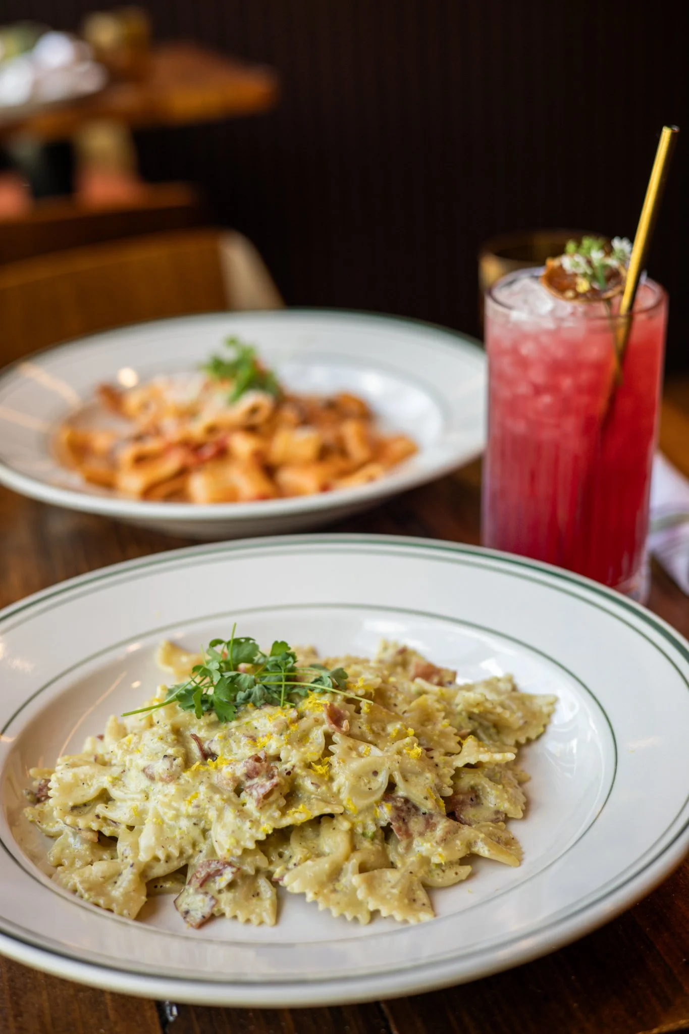
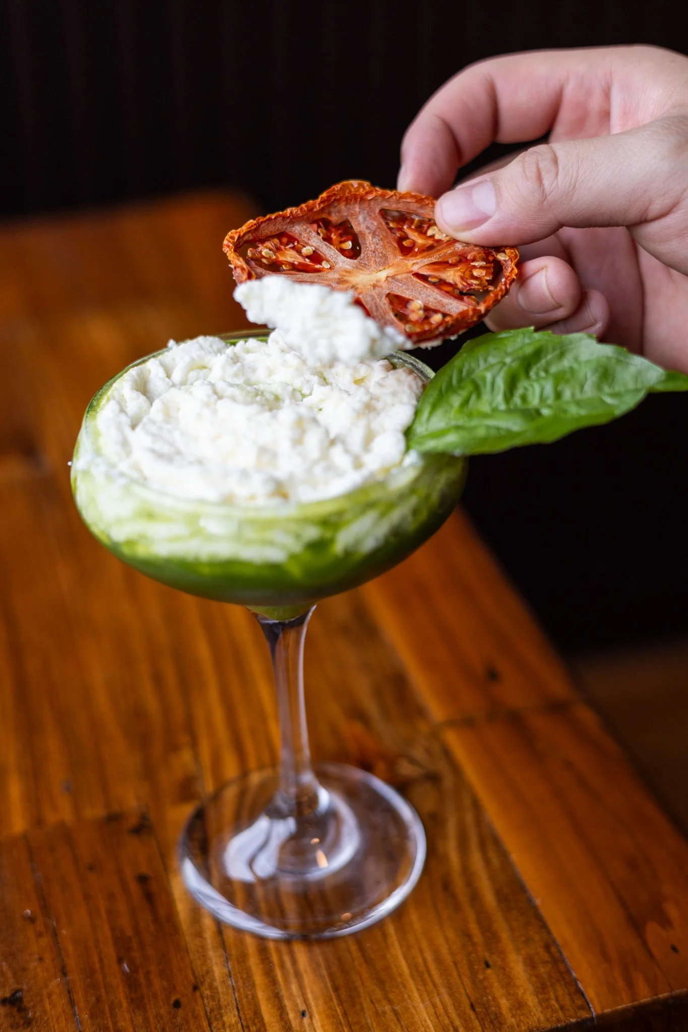
Retro is IT. There is no better place for me to pull inspiration from than in the past. 70’s Italian, old New York, what it is to be American-Italian. I had a blast with this rebrand.
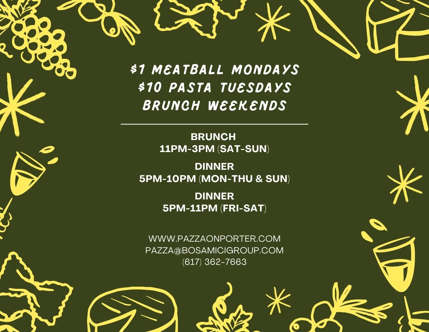
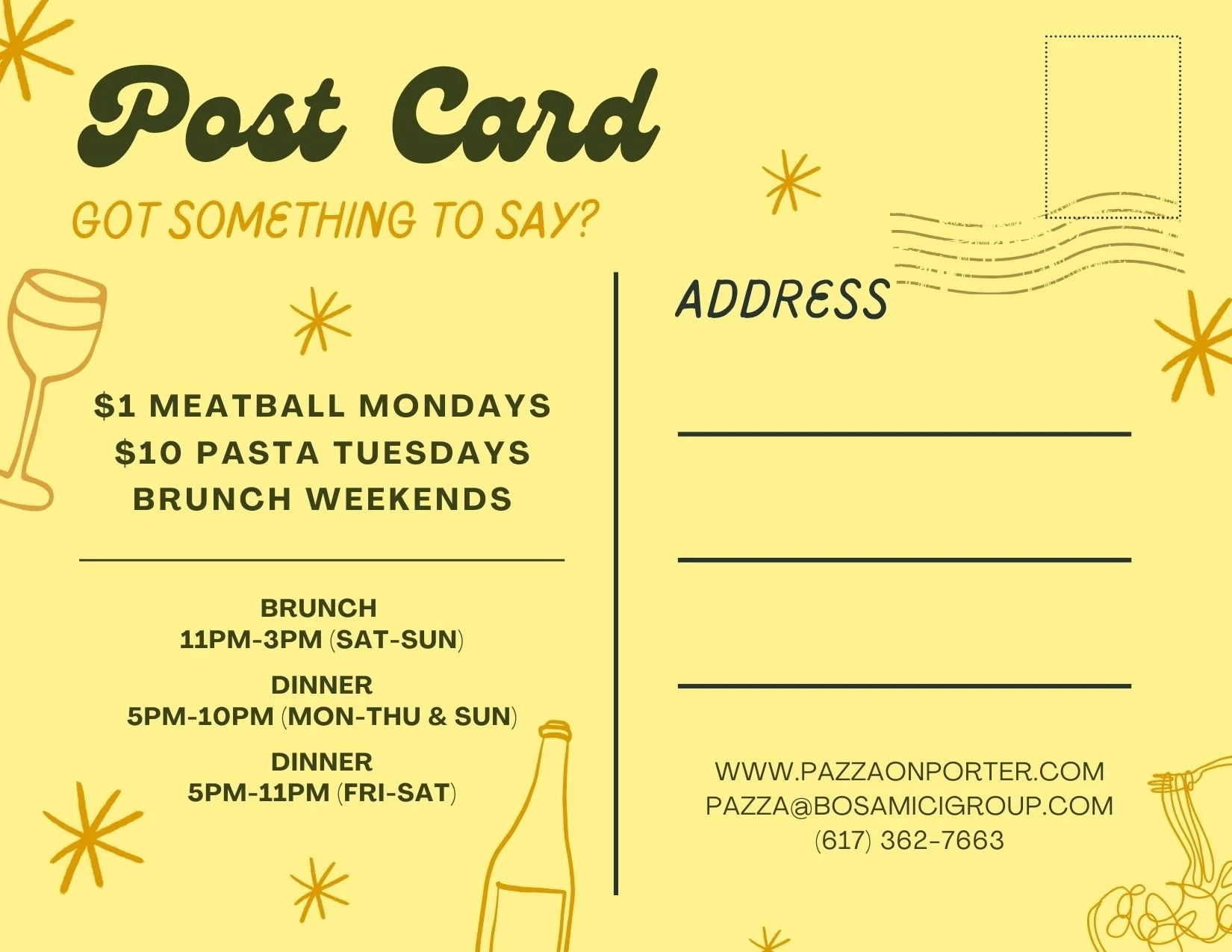
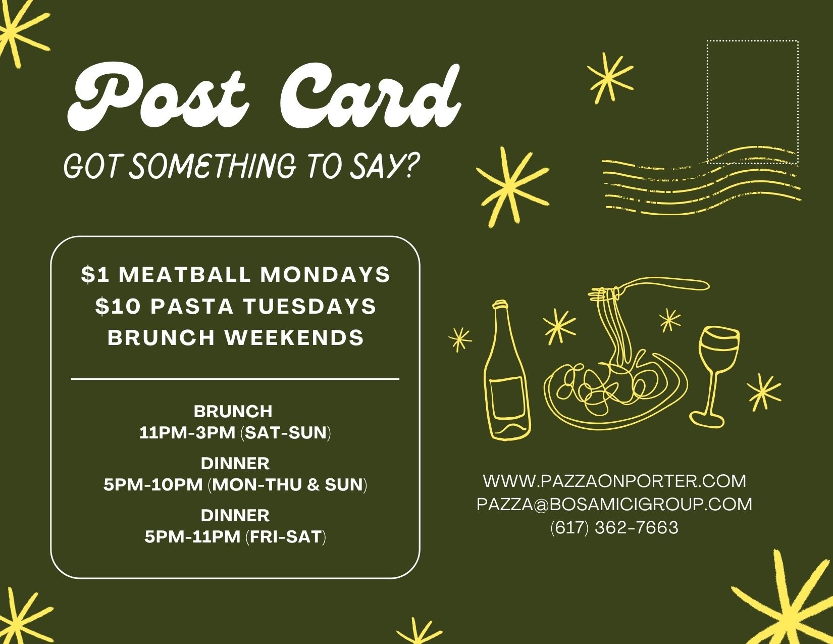
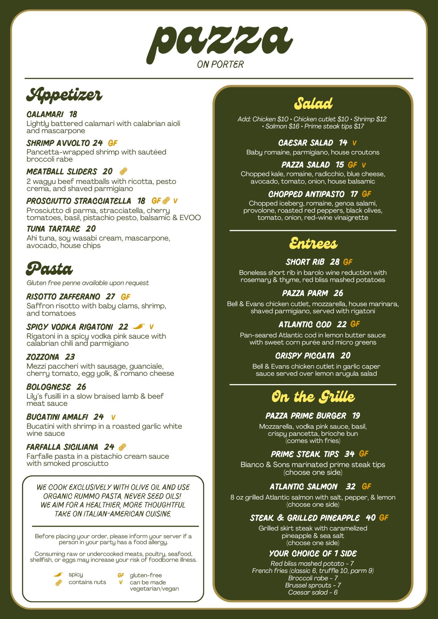
For the Brand Kit: Gentry and Pluma for fonts to bring that scribbled, retro signage feel. The colors were pulled from what an old awning at a 70’s italian restaurant would have.
Green, cream, orange, yellow, gold.
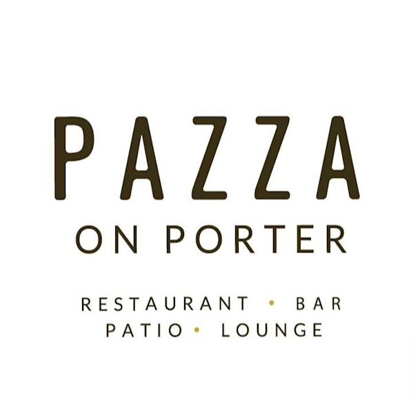
the previous branding
To realize how far we come - we have to remember where things came from! The bold and modern font with information about the restaurant had to go. We made the branding a lot more playful, light. It helps that the restaurant now is known enough that a rebrand can be more subtle in the ways we are customer facing. We can remove “restaurant, bar, patio, lounge”.